U-Pull-&-Pay
A research-driven redesign that turned an invisible salvage yard brand into a category-defining digital experience, with a 675% year-over-year lift in inventory search use after launch.
ROLE
UX STRATEGY, IA, UX/UI DESIGN, GRAPHIC DESIGN, AGILE OPTIMIZATION
TEAM
Creative, Production, UX, Dev, SEO, Analytics

YoY lift in inventory search use
YoY lift in Sell Your Car submissions
Average pages per session
PROBLEM
U-Pull-&-Pay is a self-service used auto parts salvage yard with locations across the country. When we started, the brand had a problem that went deeper than an outdated website. It was invisible. The entire salvage yard category looked and sounded the same. Similar names, similar logos, similar messaging. Customers had no real reason to choose one yard over another.
The existing site worked as a basic inventory lookup, but it missed the actual needs of a diverse audience. Inventory photos were sparse next to competitors. Search was limited. There was no clear path for junk car sellers. The loyalty program existed, but most customers never heard of it.
We had to solve two problems at once. Give U-Pull-&-Pay a distinct identity in a flat category, and build a digital experience that matched how customers actually think, search, and decide.

RESEARCH
We ran research across four markets: Indianapolis, Cincinnati, Denver, and Houston. Seven focus groups with 23 participants, stakeholder interviews with internal leadership, a full digital competitive audit, and a validation survey for the loyalty program. I supported the brand strategy side and led UX, so I worked from the findings from the start.
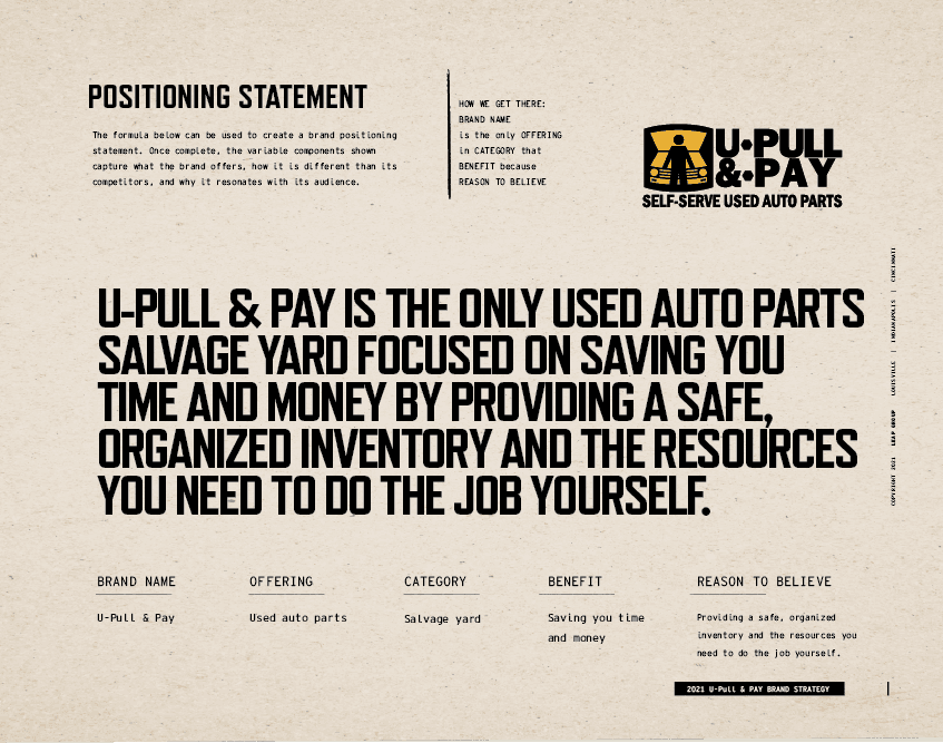
Three things shaped everything that followed. No brand in the category stood out. Customers trusted forums and each other more than any marketing. And the people walking the yard wanted tools and information, not hand-holding.
Denver made it sharpest. When asked to choose between U-Pull-&-Pay and the LKQ yard down the road, every participant chose LKQ. Better inventory photos, cleaner yard, more streamlined experience. That gave us a specific target for what the digital experience had to clear.

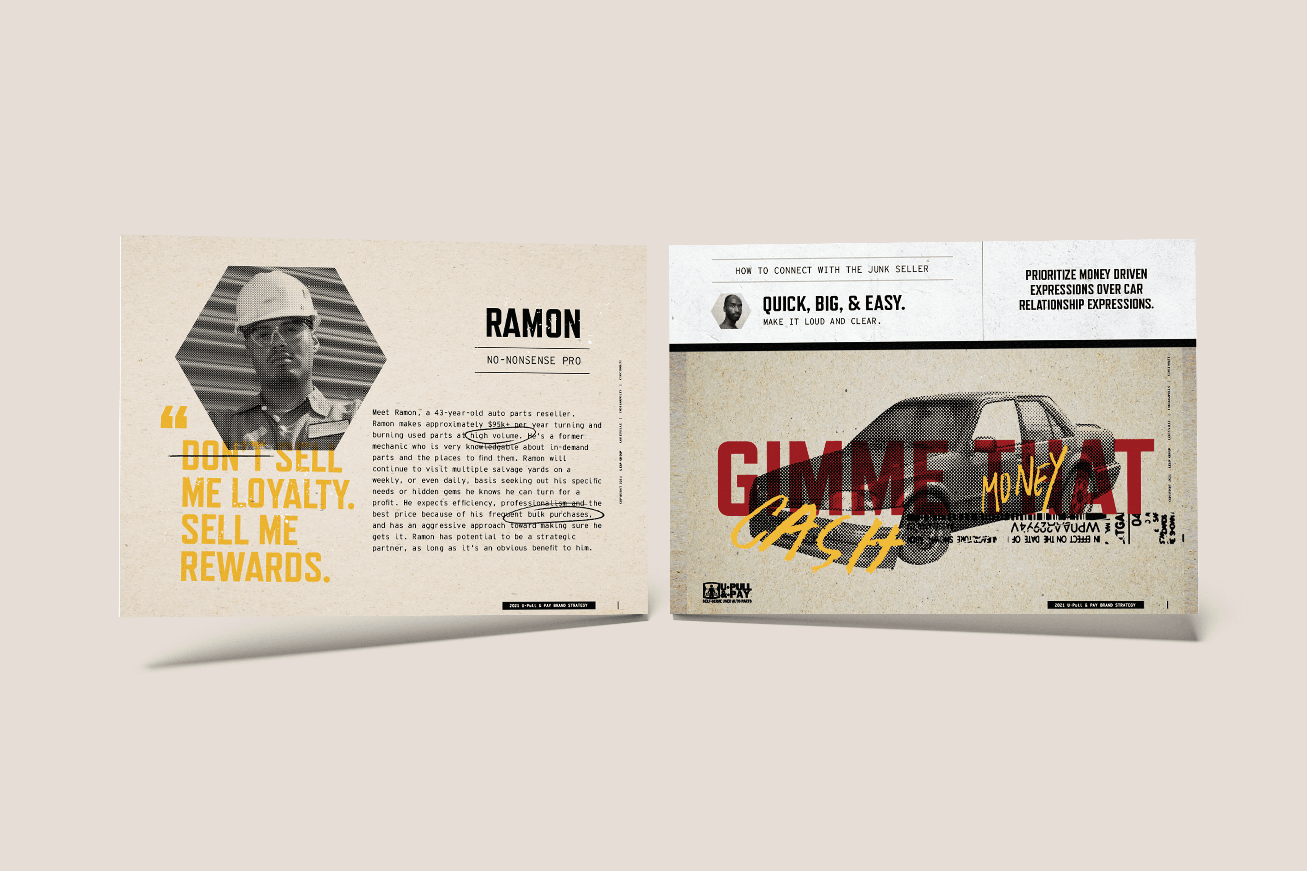
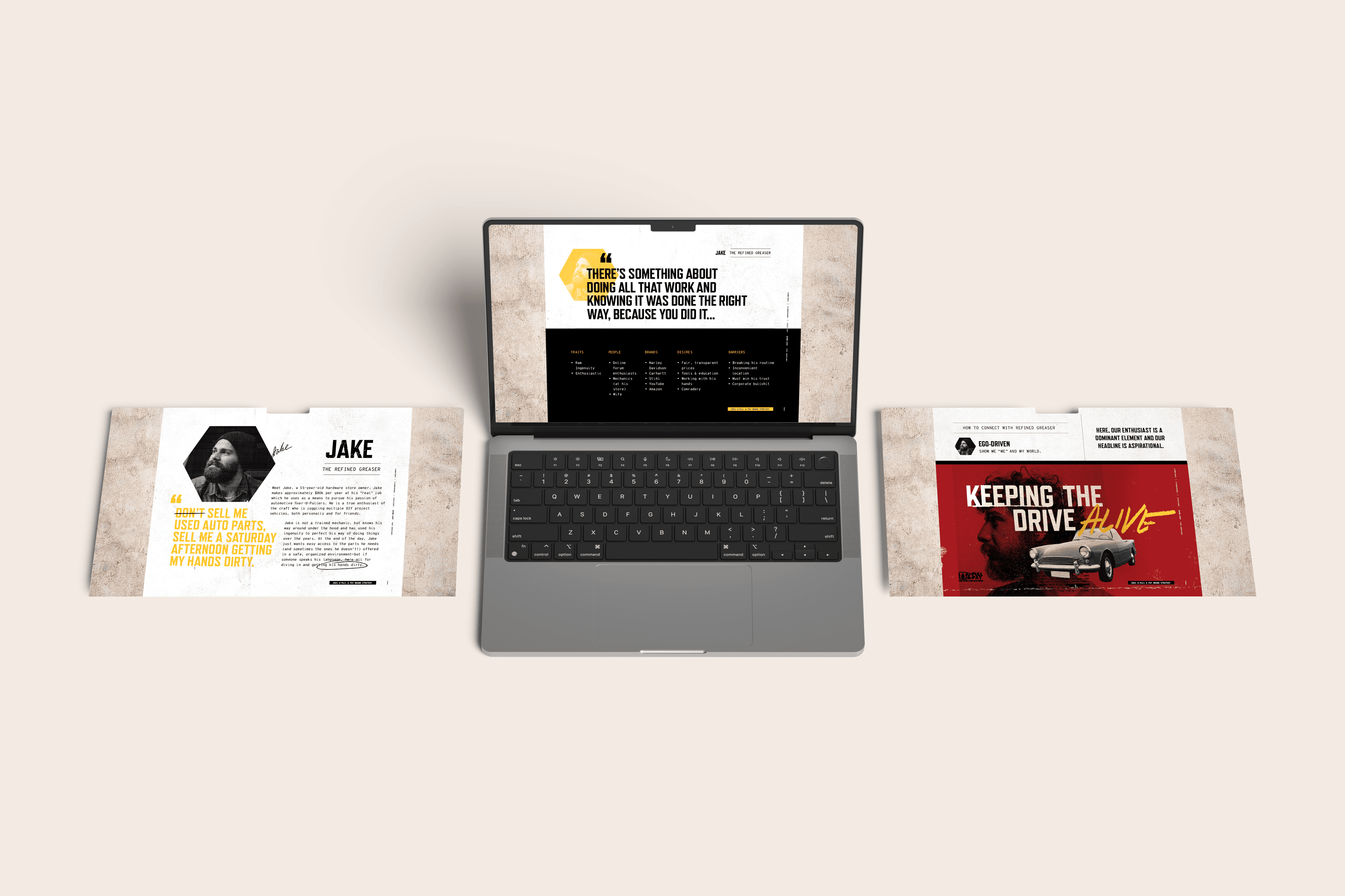
Three audiences, three different jobs to do
"Salvage yard customer" is not one person. We built three personas that drove every design and content decision on the site.

Year-over-year lift in inventory search use after launch, the exact behavior our research named as the number-one driver of yard selection.
Designing for three entry points, not one homepage
I built the IA around persona behavior, not the internal org chart. The homepage routed Jake, Ramon, and Deandre to the content that mattered to each of them through multi-path persona CTAs. The top-level nav surfaced inventory search, parts interchange, the loyalty program, and the junk car flow, because those were the moments that brought people in.
Every major feature traced back to a finding. Parts interchange came from customers asking which parts from other models fit their vehicle. The inventory search rebuild came from Denver. The Parts Perks placement came from the survey that proved customers wanted a loyalty program but couldn’t find one.
The visual identity leaned into the raw, tactile world of the yard. Limited palette of black, yellow, and deep red. Screen-printed halftone textures. Hand-embellished typography. Elements pulled from VIN plates, yard maps, and parts catalogs. The same system carried into yard maps I redesigned, aerial photography and 3D tours I helped coordinate, billboards, in-store signage, and a physical brand book bound with parts pulled from the yard itself, which won Gold at the American Advertising Awards.
After launch I kept working the site for two years in an agile optimization cadence, refining inventory and search flows based on real usage data and rolling out new functionality in sprints. The site wasn’t a deliverable. It was a product we kept improving.


The ask was narrow. Make key actions more visible on mobile, especially for people landing from organic search. I could have added a few buttons to the mobile breakpoint and closed the ticket. The analytics pointed at a bigger problem. Most people never touched the homepage. They landed deep, on a location or parts page, carrying a specific intent, and the page in front of them was built for browsing, not for the thing they came to do.
So I reframed the work. Instead of bolting CTAs onto mobile, I proposed aligning every high-traffic entry page with its likely intent, across all devices. The mobile-only fix was cheaper, but it would have split the mobile breakpoint from every other view, left the same change to maintain in eight places across the English, Spanish, and U-Pull-&-Pay sites, and done nothing about the intent mismatch driving the bounces in the first place.
I tested the reframe instead of asserting it. We ran the redesigns against the live pages on the highest-traffic templates and let conversion decide. Parts pricing moved from 78.5 to 84.7 percent, parts interchange from 26.5 to 33.5, and the Birmingham and Louisville location pages jumped eleven and thirteen points. Not everything won. The search inventory redesign trailed its control and the used cars test never pulled enough traffic to trust, so I held both rather than ship a design the data didn't back.
Tests told me which layouts won. Heatmaps told me why. The busiest element on every location page, the Select Make dropdown, was also the biggest source of dead and rage clicks. It worked fine once loaded, so the failure was timing: the form rendered a beat before its JavaScript woke up, people tapped into dead air, then tapped again. I scoped a lightweight loading state to fix it with no backend change. The same click data reordered the rest of the page, leading the CTA bar with parts pricing, pulling the yard address up from a spot most visitors never reached, and making the whole car card a link where people were already tapping the title.
The launch is the part people remember. The site that exists now is the sum of these smaller, tested decisions: a shared form system rolling out page by page, and a priority matrix that ranks every remaining fix by effort against impact so the roadmap follows evidence instead of whoever asks loudest. Each one traceable to something a real user did.
We launched in an agile model and kept enhancing the site after release. The numbers reflected both the repositioning and the UX work.
QUANT 01
YoY lift in inventory search use
QUANT 02
YoY lift in Sell Your Car submissions
QUANT 03
Average pages per session
QUAL 01
Three-path persona entry
Homepage CTAs routed each persona type to the content that mattered most to them, replacing a generic one-size-fits-all front door.
QUAL 02
Parts interchange tooling
Cross-reference search lets customers find compatible parts across makes and models, built directly from research findings.
QUAL 03
Surfaced loyalty program
Parts Perks moved from invisible to visible with clear point tracking and sign-up prompts integrated into the inventory flow.
QUAL 04
Brand book bound from yard parts
Physical brand guide built with materials pulled from the salvage lot won Gold at the American Advertising Awards.

5th District Consumer Website Gold

Gold General Websites Redesign
Louisville Consumer Website Gold

Silver General Websites Automotive
Louisville Peoples' Choice Gold