University of Michigan Credit Union
A strategy-first redesign that turned a login gateway into a real acquisition channel, with a 52% lift in mortgage application starts in the first 30 days.
ROLE
UX Strategy Lead, IA, UX/UI Design
TEAM
UX, Dev, SEO, Analytics

Mortgage app starts, first 30 days
Technical site health score post-launch
Organic traffic lost through migration
PROBLEM
UMCU was on its fifth redesign, and every previous one had been driven by external constraints instead of a long-term vision. The site worked as a place to log in and check rates, but it wasn’t helping people make confident financial decisions and act on them.
Prospective members had to click through too many pages to find rates, eligibility, or a way to apply. The navigation followed UMCU’s internal structure, not how people actually think about their finances.
A cleaner design wouldn’t fix this. The site needed a new foundation, built around how real people at different life stages look for, evaluate, and act on financial products.
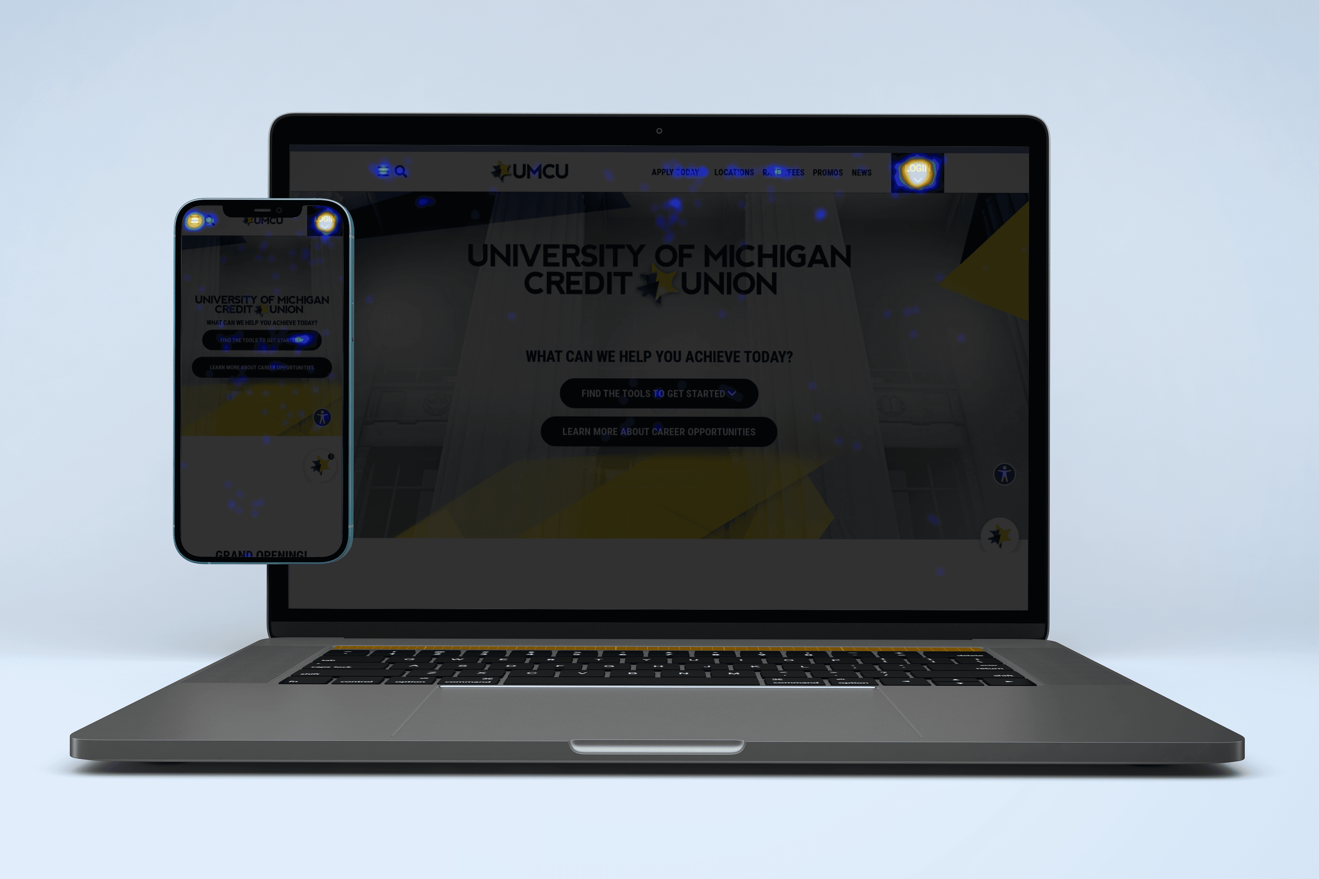
Legacy website heatmap showing login CTA garnering most of the clicks
RESEARCH
I started with research because the biggest risk on this project was building another site on internal assumptions. UMCU doesn’t have one typical user. A 22-year-old opening their first checking account and a 55-year-old refinancing a mortgage have fundamentally different needs, timelines, and anxieties. We surveyed 350 non-members across Michigan on perception, intent, and digital banking habits. I helped facilitate two 90-minute stakeholder focus groups across leadership, marketing, and operations.
I led a competitive analysis of Michigan credit unions and a brand mentor analysis looking at companies outside finance. The pattern was clear. No credit union in the set stood out. Users cared most about clarity, usability, and navigation when evaluating a financial institution online. The website was a critical consideration-stage resource even for people who did their daily banking in the app.


Personas that survived the strategy deck
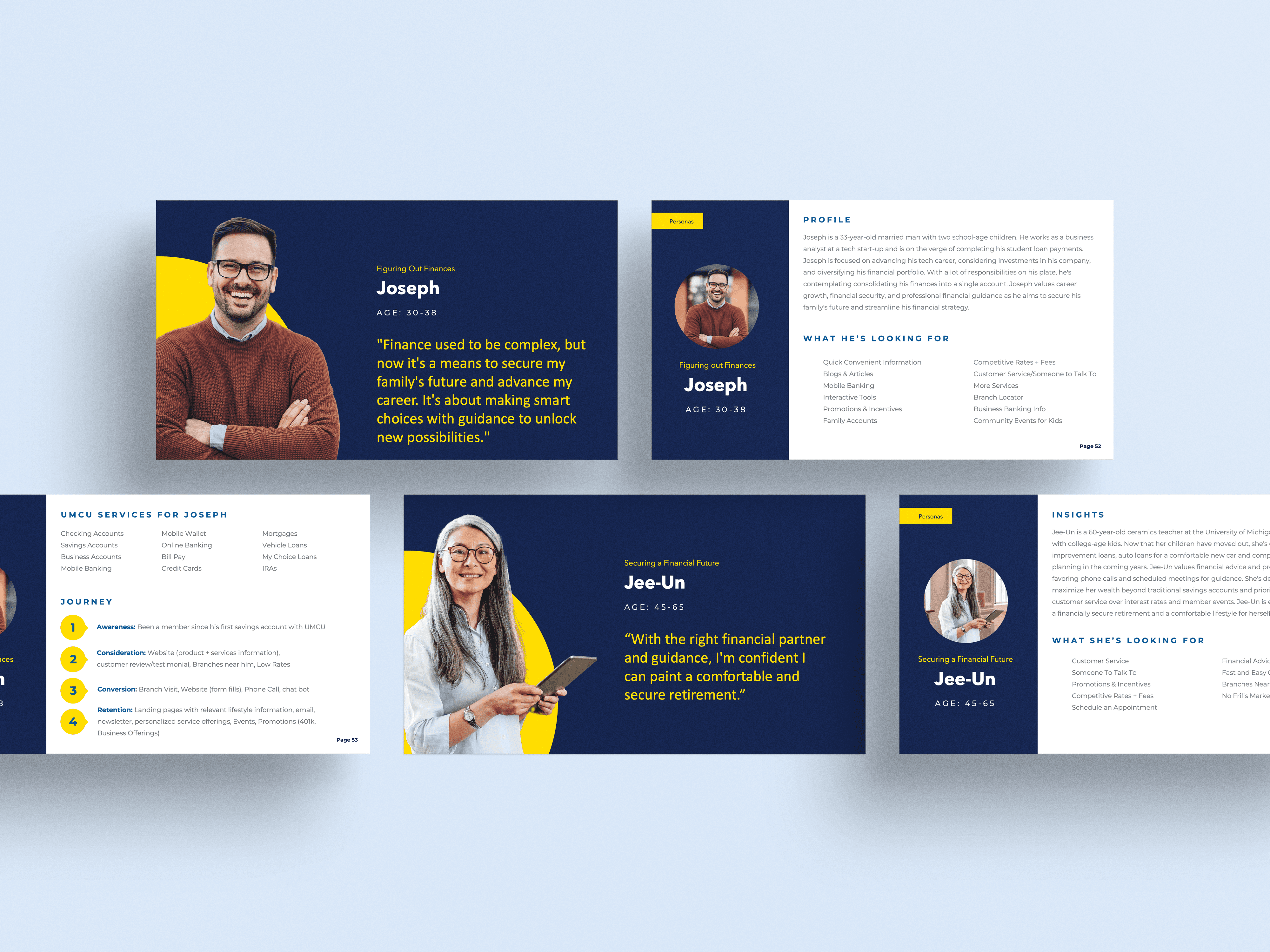
UMCU needed to serve people across a wide spectrum of financial life stages. Each group arrives with different questions, different confidence levels, and different urgency. I built a persona set around decision behavior, not demographics. These weren’t the kind of personas that live in a strategy deck and get forgotten. They became the organizing model for the entire redesign, shaping navigation, content priority, and the order of every product page.


Lift in mortgage application starts in the first 30 days after launch, on UMCU's highest-stakes product.
From login gateway to proven acquisition channel
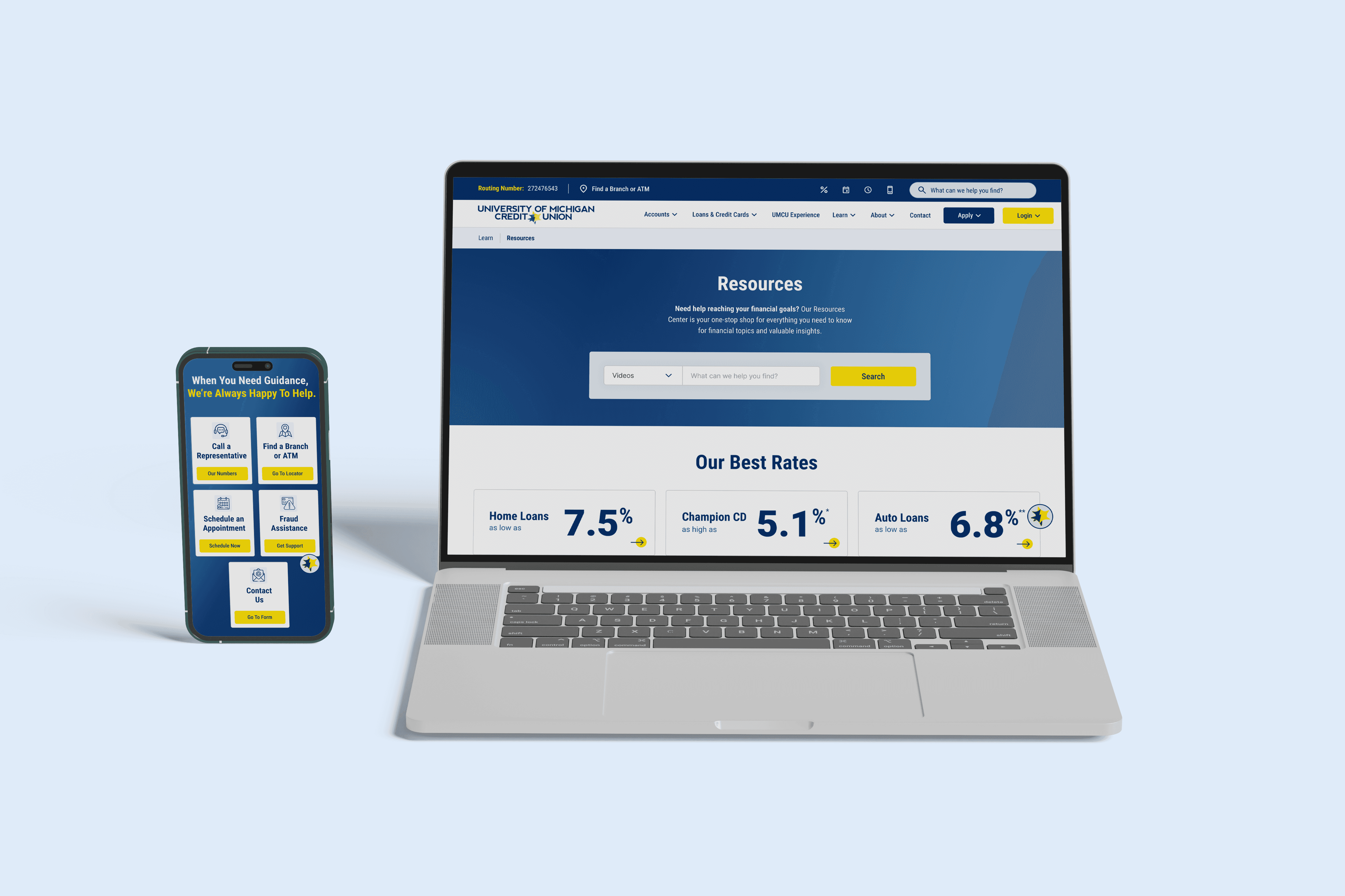
The IA was rebuilt around how people actually move through a financial decision, not how UMCU’s departments are organized. Rates, eligibility, and the path to apply moved up. Cross-product comparisons got real space. Mortgage, auto, and deposit account funnels each got repeated, well-timed CTAs tied to the questions a user is asking at that point in the page. The design system did two jobs at once. Give UMCU a distinct, trustworthy presence, and let internal teams create and update pages without custom design work every time. I standardized page patterns across product pages, resource hubs, and educational content.
Rate and comparison tables got rebuilt for mobile as scannable, scrollable formats instead of the horizontal-scroll patterns that were causing drop-offs. Launch wasn’t the finish line. I implemented a GA4 model focused on meaningful actions, application starts, CTA engagement, funnel progression, and content depth, not just pageviews. I added heat-mapping and session recording to spot friction patterns like dead-clicks and rage-clicks. After launch, I set a quarterly reporting cadence that combines analytics, search performance, and behavioral signals into a single view, with a prioritized backlog the team can work from.


Traffic held after launch. People were finding the site and moving through it. What they were not doing, consistently, was converting. It was the risk the research had named, now showing up in live behavior, and I had built the site to be measured so I could see where.
Before launch we set up a GA4 model around meaningful actions instead of pageviews, paired with CrazyEgg heatmaps, scroll-depth maps, and session recordings. The clearest signal came from the clicks that went nowhere. On the balance transfer page, close to a third of all clicks fired on elements that did nothing, and the hero headline and offer copy were pulling more clicks than most of the real buttons. On the rate tables, people clicked rate numbers and term labels the same way, expecting them to lead somewhere. Every one of those clicks was a user telling me what they wanted to do next.
The easy move was to guess and start linking. I decided to ask instead. I specified a one-question survey that fires when someone lingers on a rate page without acting: what are you trying to do next, see a payment estimate, apply, or compare. The answer decides where the rows link, and takes the assumption out of the strategy before a single element gets wired.
That same behavioral read drove the rest. I moved rates out of a buried Resources menu and into the account and loan flows, split the single rates page into individual URLs so each can rank and convert on its own, pulled a buried mobile calculator up toward the hero, and scoped a widget-level personalization framework that shifts CTAs by intent instead of maintaining separate pages.
The launch gets the attention. The version of the site that exists a year later is built from these smaller, evidenced decisions, each one traceable to something a real user did.

The redesigned site gave UMCU something it didn’t have before. A flexible, measurable platform built for ongoing optimization instead of one that treats launch as the finish line.
QUANT 01
Mortgage app starts, first 30 days
QUANT 02
Technical site health score post-launch
QUANT 03
Organic traffic lost through migration
QUAL 01
Reduced friction signals
Dead-clicks and rage-clicks dropped through clearer hierarchy and interaction cues across the site.
QUAL 02
Shorter conversion paths
Well-timed CTAs guided high-intent products like mortgage, auto, and deposit accounts.
QUAL 03
Stronger engagement
CTA interactions, video plays, time per page, and session duration all increased after launch.
QUAL 04
Improved findability
Technical SEO remediation and cleaner content architecture unlocked new high-intent visibility.